Wallpaper With WainscotingPaper above, paint below, and nothing white in between.
Wallpaper over painted wainscoting is the most reliably beautiful wall you can give a small room — a powder room, a hall, a pantry, a little bedroom. It protects the paper where hands and bags and mops reach it, and it gives a pattern something solid to stand on. It only goes wrong in three places: the height, the colour, and the trim.
Begin your room →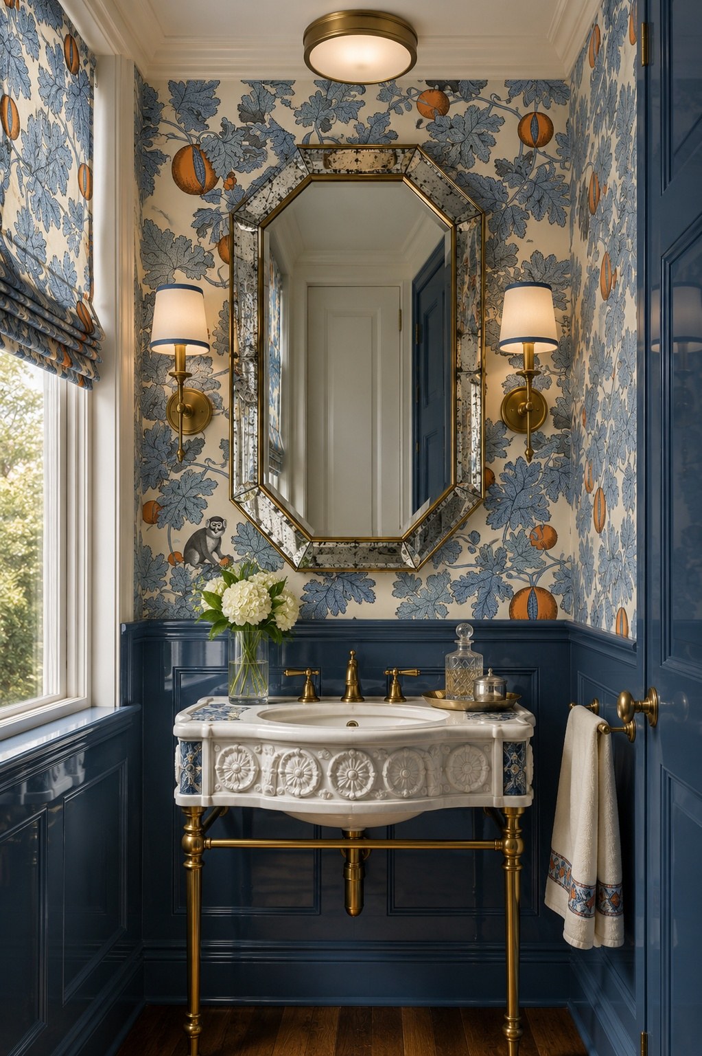
How high should wainscoting go under wallpaper?
Higher than you think. The builder’s instinct is a low dado at about a third of the wall, and under a pattern it almost always looks timid — a skirting that got ambitious. In a small room, take the panelling up to around chair-rail height or above, so it reads as a deliberate base for the room rather than a strip of trim.
The exception is a very large-scale paper. If the pattern needs room to repeat — a big trailing botanical, a mural — keep the panelling lower and give the paper the height. The question is always: which of the two is the room about?
What color should the wainscoting be?
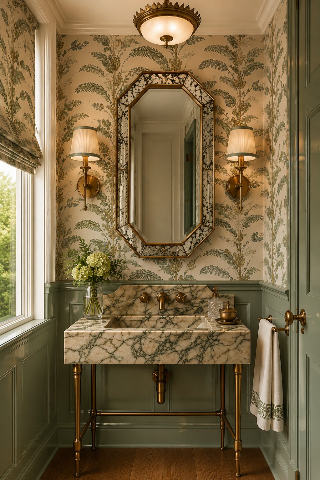
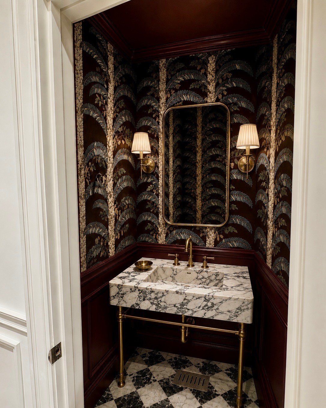
Take it from the paper. The deepest colour in the pattern is the safest choice — navy under a blue leaf, sage under a botanical, oxblood under a palm — because it anchors the bottom of the room the way a dark floor does. A mid-tone from the paper is softer and suits a lighter, airier pattern.
Never take it from the paper’s lightest colour, and never default to white. White panelling under a patterned paper splits the wall in two and makes the paper look like it was added afterwards.
Gloss or flat on the panelling?
Gloss, or a high satin. The sheen does two things: it wipes clean, which is the whole practical point of wainscoting, and it gives the bottom half of the wall a different texture from the paper above it. Matt paper over glossy panelling is the classic combination for a reason.
The trim: the chair rail, the skirting and the door
Paint every piece of trim the same colour as the panelling — the chair rail, the skirting, the door casing, the window. The moment one of them is white, the eye goes straight to it. In a small room, carry the same colour up into the crown and the ceiling as well, and the paper sits in a frame of one colour on every side.
Which wallpaper patterns work above wainscoting?
Patterns with a clear ground and a confident scale: botanicals, trailing vines, chinoiserie, large leaves. Because the panelling cuts the wall height, a pattern that would feel overwhelming floor to ceiling becomes exactly right above a dado. What struggles is a tiny all-over print — above panelling it reads as texture, and the room loses its focus.
Wainscoting styles
Flat recessed panels are the most versatile, and suit almost any paper. Raised and fielded panels are grander, and want a grander pattern. Beadboard and tongue-and-groove are more cottage — lovely with a small floral or a stripe, less convincing under a formal chinoiserie. If the room has none, applied moulding painted in gloss is a perfectly good way to add it.
Want to know what I’d do with yours?
Send a photograph of the room and I’ll be in touch with where I’d take it. If you then want the whole room designed — paper, paint, stone, basin, tap, lighting and hardware, every piece named and sourced — a room starts at $750 and takes about a week.
Questions
Can you put wallpaper above wainscoting?
Yes, and it is one of the most traditional ways to use paper. The panelling protects the bottom of the wall where it gets knocked and splashed, and gives the pattern a solid base. Paint the wainscoting a color taken from the paper, in gloss or a high satin.
How high should wainscoting be with wallpaper above it?
In a powder room or hall, around chair-rail height or a little above usually looks most deliberate. A very low dado tends to look timid under a pattern. With a very large-scale paper, keep the panelling lower and give the paper the height.
What color should wainscoting be under wallpaper?
A color from the paper, usually its deepest shade: navy under a blue leaf, sage under a botanical, oxblood under a palm. Avoid white, which splits the wall in two and makes the paper look like an afterthought.
Should the chair rail be painted the same color as the wainscoting?
Yes. Paint the chair rail, skirting, door casing and window trim the same color as the panelling, so nothing white interrupts the scheme. In a small room, carry the same color into the crown and ceiling as well.
What wallpaper pattern looks best above wainscoting?
A confident pattern with a clear ground: botanicals, trailing vines, chinoiserie and large leaves. A pattern that would feel too much floor to ceiling is often exactly right above a dado. Very small all-over prints tend to read as texture.
Powder room wallpaper ideas · Powder room ceiling ideas · Color-drenching a small room · Builder-grade powder room makeover · Virtual wallpaper consultation
Grayson Alchemy is the aesthetic layer, not a full-service design firm. After a quick intake call, you send your room and Jamie Brett, based in Beverly Hills, sends it back designed — powder rooms, guest bathrooms, butler’s pantries, home bars and small bedrooms — so you, your contractor or your own designer know exactly what to build. Starting at $750, about a week.
It is not project management, ordering or installation, and not an AI image generator. Every scheme is hand-designed and every piece is named, real and buyable.